- Joined
- Oct 18, 2009
- Messages
- 61,115
the user info box looks fine on my display.. the user quotes have never been gold.
It looks like the "Staff Member" tag is still the wrong gold, if that's what it was supposed to be.
the user info box looks fine on my display.. the user quotes have never been gold.
It looks like the "Staff Member" tag is still the wrong gold, if that's what it was supposed to be.
Boy have I got some bad news for youI left that old gold to give some contrast. If I paint the entire website with the same color, it's going to look like öööö.
Boy have I got some bad news for you
what’s the dial up baud rate?Is this Techsidelines now?
So an unofficial fan message board has the correct gold on it's page before RamblinWreck.com
Seems about right
I think the rest of us are willing to pay the extra .02 for the real colors. GTFan could handle this.I left that old gold to give some contrast. If I paint the entire website with the same color, it's going to look like öööö.
http://enchroma.com/Looks like Tech has been changed to the Brown Jackets to me...
The yard markers on the field are the new font.
I left that old gold to give some contrast. If I paint the entire website with the same color, it's going to look like öööö.
Believe you may be correct. Sadly so IMHO.
Non traditional fonts do not stand the test of time.
Wonder how long some of these changes will last? 5, 10, 20 years.
Most of the changes are good, some not.
The Georgia Tech with the weird R and weird H.Are you talking about the "Georgia Tech" in the endzones and on the T-shirts? Because the interlocking "GT" is the same as it ever was. Same as it ever was.
It looks like the "Staff Member" tag is still the wrong gold, if that's what it was supposed to be.
I left that old gold to give some contrast. If I paint the entire website with the same color, it's going to look like öööö.
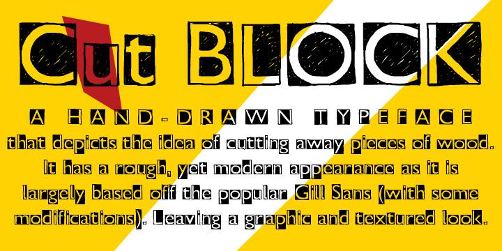
That's the Cut Block Font.The Georgia Tech with the weird R and weird H.
That's the Cut Block Font.
I think the rest of us are willing to pay the extra .02 for the real colors. GTFan could handle this.
 öööö
ööööThat's the Cut Block Font.